

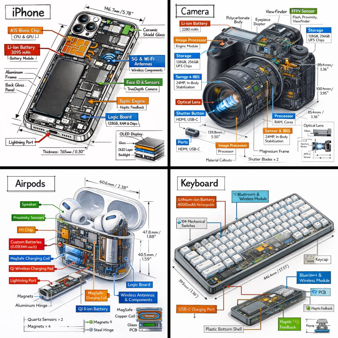
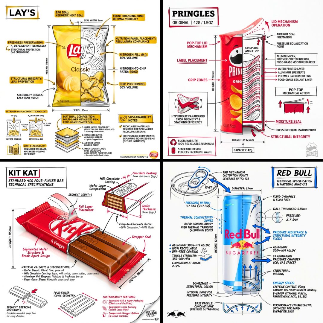
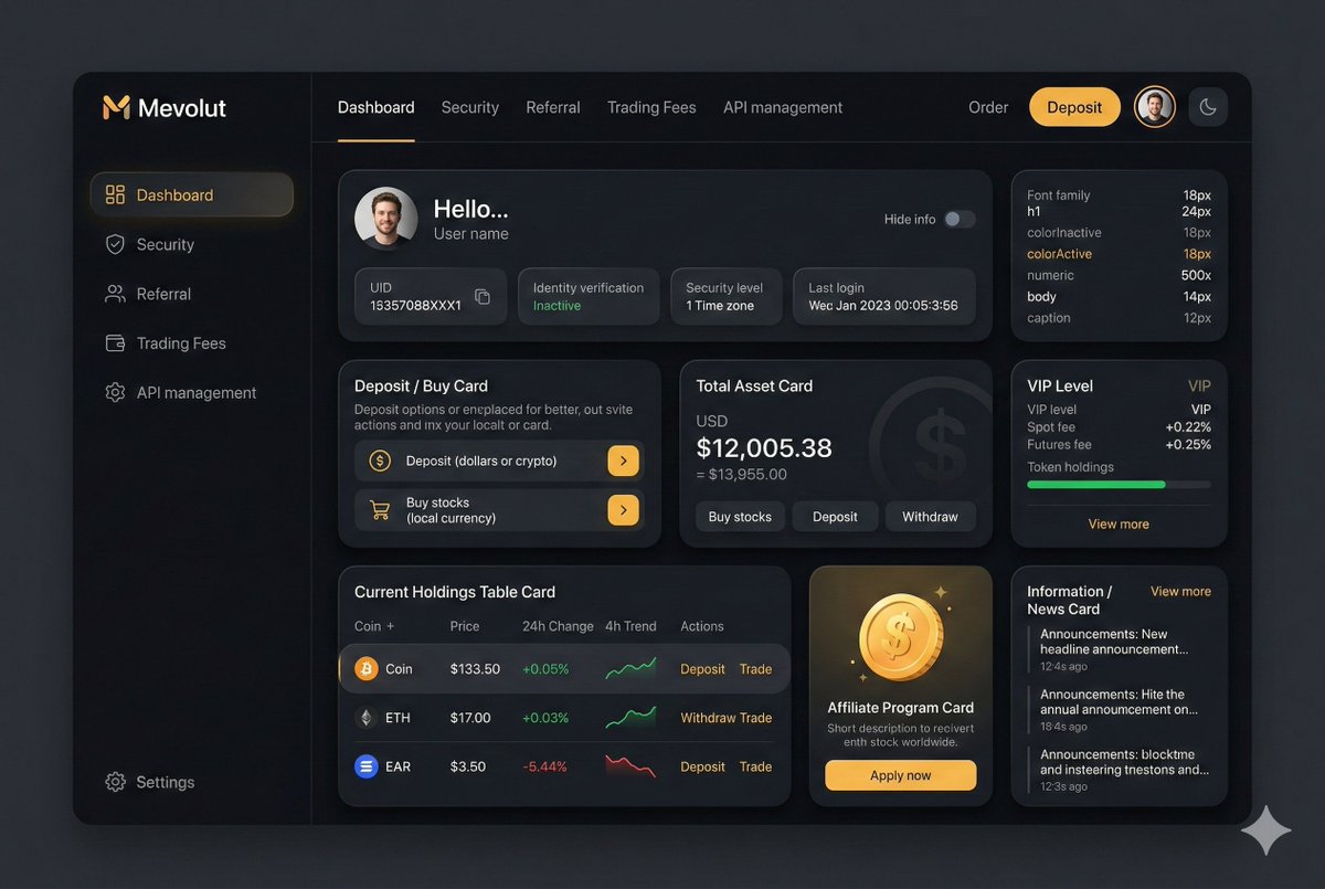
SaaS dashboard concepts
Explore data-heavy layouts, analytics panels, admin tools, task boards, and product surfaces before committing to UI details.
Generate interface concepts, dashboard visuals, app screens, icon systems, and landing page graphics with prompts that describe layout, product context, components, and visual style.
Prompt examples
These AI UI design prompts come from the prompt gallery. Copy one, adapt the subject and constraints, or open it in the generator to start from a working structure.
Writing guide
Use the guide after browsing examples to understand which details are worth changing before you generate.
AI UI design prompts are useful when you need a fast visual direction for an app, SaaS product, dashboard, mobile screen, landing page section, feature graphic, or icon system. The key is to avoid asking for a vague “modern UI.” Good UI prompts describe the product category, user workflow, screen type, component density, information hierarchy, color system, spacing, device frame, and visual tone. That gives GPT Image 2 and Nano Banana enough structure to produce a usable mockup direction instead of a generic interface collage.
This page focuses on prompt patterns for app mockups, dashboard concepts, onboarding screens, pricing interfaces, landing page graphics, data panels, control surfaces, product illustrations, and UI-adjacent brand graphics. These prompts are not replacements for production design files, but they can help you move faster during exploration. A founder can test a product story, a designer can explore visual systems, a marketer can create a launch graphic, and a developer can communicate the feel of a tool before investing in detailed UI design.
GPT Image 2 UI prompts often work best when you keep the screen objective narrow: analytics dashboard for creators, mobile finance onboarding, AI image editor control panel, project management kanban, or ecommerce product configurator. Nano Banana can be useful for playful UI scenes, icon concepts, 3D app illustrations, and looser visual exploration. In either case, specify that the output should be a polished mockup, not a functioning interface, and avoid requesting too much tiny text. Use the result as direction, then rebuild the interface with real components.
Use this sequence as a reusable prompt pattern. Replace the scene details, keep the order, and tighten the constraints after the first generation.
Name the app type, user, and task, such as AI image editor, finance dashboard, ecommerce builder, CRM pipeline, or travel planning app.
Choose one screen or asset: dashboard, onboarding screen, pricing page, mobile app mockup, settings panel, landing hero graphic, or icon set.
Describe primary cards, navigation, charts, input controls, image previews, status panels, and the visual density expected for the interface.
Define color palette, surface style, typography mood, border radius, shadows, dark or light mode, and whether the UI should feel technical or friendly.
Ask for clean readable blocks, minimal fake text, realistic spacing, no broken controls, and a mockup composition suitable for marketing or ideation.
Use cases
Use the scene as a creative brief. The more clearly the prompt names the output job, the easier it is to refine the generated image.
Explore data-heavy layouts, analytics panels, admin tools, task boards, and product surfaces before committing to UI details.
Create product visuals for hero sections, feature callouts, comparison sections, and launch pages.
Generate app screen directions for onboarding, search, checkout, profile, image editing, finance, wellness, and productivity flows.
Build early concepts for icon families, feature illustrations, 3D UI objects, and product storytelling visuals.
Practical tips
Prompt one screen at a time. Multi-screen requests often reduce clarity and make tiny interface details harder to control.
Describe the product job before describing the style. A UI mockup needs purpose first and polish second.
Use “realistic component spacing” and “clear hierarchy” to avoid crowded interface outputs.
For marketing graphics, ask for a composed product mockup rather than a full usable interface.
Treat generated UI as inspiration. Rebuild final layouts with real design system components.
Related scenes
Scene pages are connected intentionally so you can move from one creative job to the next without returning to a blank prompt box.
Build poster concepts with stronger composition, hierarchy, mood, typography direction, and campaign intent by starting from prompt patterns made for visual communication.
Explore sceneCreate polished product scenes, ecommerce photos, launch visuals, and brand-led ad concepts with prompts that describe the product, surface, lighting, camera angle, and commercial context.
Explore sceneDevelop stylized characters, 3D icons, isometric scenes, objects, figurines, and playful illustration systems with prompts that define form, material, lighting, and personality.
Explore sceneFAQ
They are best for concepts, mockups, and visual direction. Use the generated result to explore hierarchy, mood, and layout, then rebuild the final UI in a design or code system.
GPT Image 2 is a strong choice for polished UI mockups, layout-like graphics, and product visuals. Nano Banana is helpful for looser concepts, 3D UI illustrations, and playful interface scenes.
Add product context, user type, screen purpose, component details, density, color system, and constraints. Avoid relying only on phrases like modern, clean, or beautiful.
Keep exact text short. For most UI mockups, ask for readable blocks or placeholder labels, then replace final copy manually in a design tool.
Pick one prompt, replace the product, subject, scene, or style details, then generate a first version. Use the gallery link when you want more examples in this category.